Nalin Bhardwaj
University of California, San Diego, CA, USA.
Email: nalinbhardwaj (at) nibnalin (dot) me
https://doi.org/10.5281/zenodo.8241625
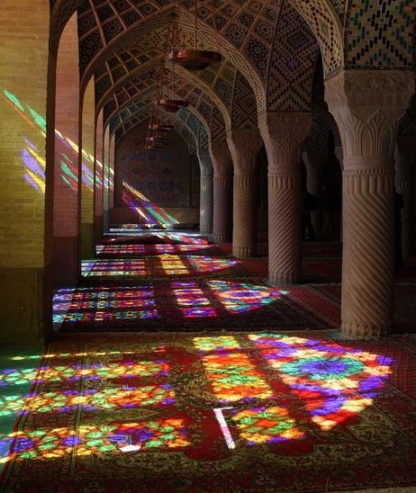
One of my favorite “things of beauty” are stained glass windows. By themselves, they contain intricate works of art with vivid color palettes that overlay silhouettes of the outside world. They’re like a dreamy, imaginative capture of the beauty of nature and of the precise capability of human to weave intricacy into the commonplace object. But what make stained glass an extremely unique medium is its shadow. The shadows stained glass windows cast serve a utilitarian architectural purpose (that of lighting insides of churches and other buildings) while being a deep expression of color and emotion (Figs. 1, 2). It is almost as if every stained-glass panel has the capability to tell a multifaceted story by itself.

Films, as an art form, have the unique ability to fully engage our auditory and visual senses, just like the beautiful imagery of stained glass. Unfortunately, a side effect of the format of films is that our untrained brains are so engrossed in the momentary frames that they tend to miss the larger patterns of filmmaking. They neglect the “shadows” films cast. Most of us give very little thought to the underlying philosophy of cuts, narrative structures and sound design.
In my essay, I want to explore the “shadows” of these stained-glass windows (i.e., films) to understand the patterns exhibited by the church (i.e., the art of filmmaking). I will take an objective, data-backed approach to analyzing films, using code to make observations about films. My project will primarily focus on the visuals of a film, and in particular, I will look at two seminal works, Akira (1988) and Ghost in the Shell (1995). I will utilize the atoms of a movie: the frames themselves. Using these frames, I will analyze color palettes and tones and look at some of the psychological underpinnings of color theory in film (and horror). Firstly, however, let’s discuss some basic ideas of color theory and introduce the visualizations that will follow in the rest of this paper.
DIMENSIONS OF A FRAME
A picture is worth a thousand words.
By raw numbers, your average film is two hours long and uses the industry standard frame-rate of 23.976 frames per second. That means the average film is composed of 2 · 60 · 60 · 23.976 = 172,627.2 ≈ 170 thousand pictures. If the cliché saying is anything to go by, this rigorous analysis tells us that every film is worth about 170 million words. Since analyzing these 170 million words individually is beyond the scope of human lifetime, we need tools. In my paper, I employ graphic visualizations to summarize this data into something meaningful.
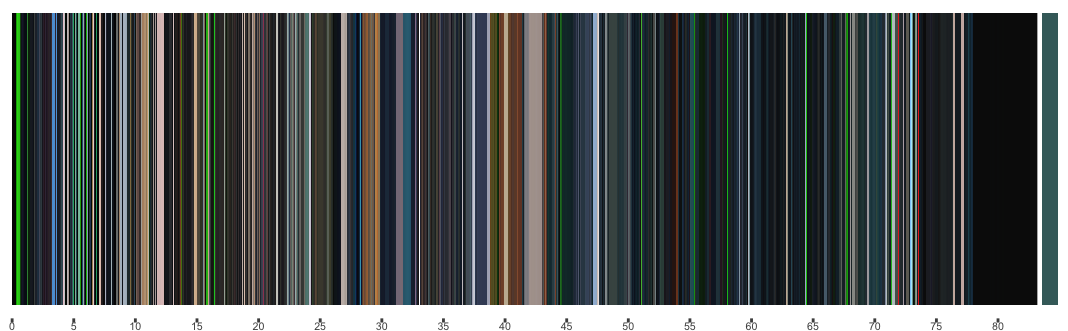
One of the most representative visualizations of a film is the movie barcode. A movie barcode is generated by taking every frame of a movie, extracting its dominant color, and skewing it to be only a pixel wide slice. By lining up these slices in a row, we can create a barcode-like image of an entire film. The dominant color of a frame is the most representative color based on a k-means clustering[1]. In its essence, a movie barcode is a method of compression that represents the movie in a single image.
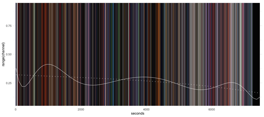
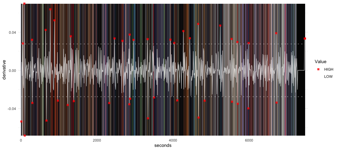
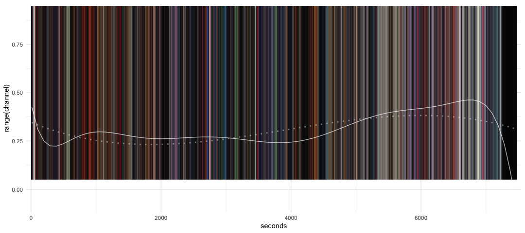
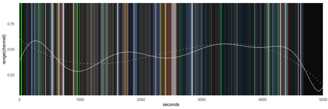
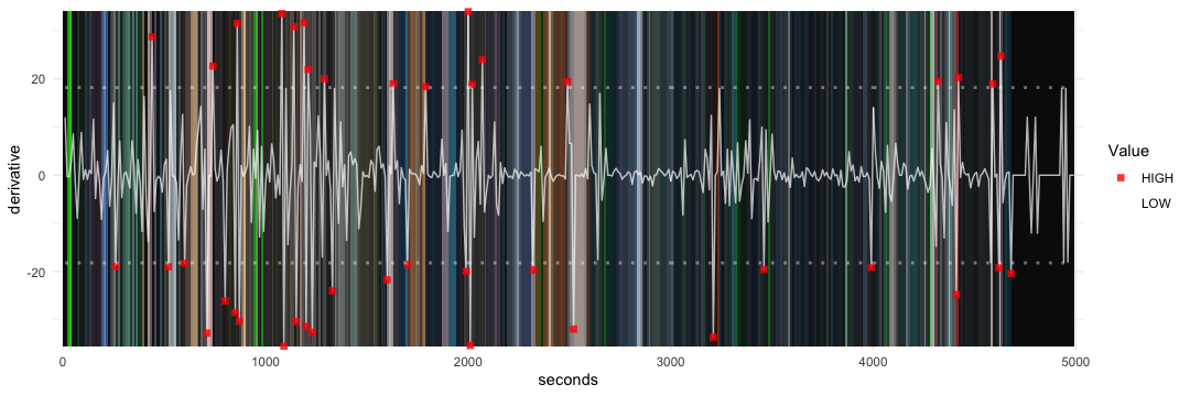
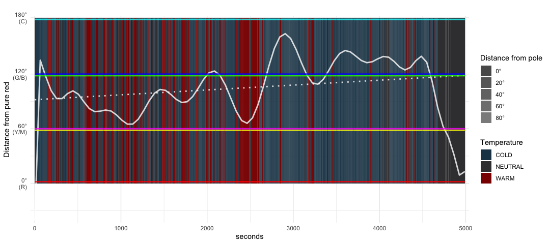
Color, as an abstract concept, is very hard to describe. However, to make its study more discrete and accessible, computers and cameras use the HSL (Hue, Saturation and Luminosity) scheme to represent color. By definition, hue refers to the color of a point, as found along the spectrum or a color wheel (Fig. 3). Saturation indicates the intensity of a hue. Higher saturation hues appear ‘stronger’, for example being ‘more red’ or ‘more blue’. Luminosity is a measure of how bright or dark a hue is. Physically, luminosity corresponds to amplitude and consequent energy of electromagnetic waves of light. To study these three characteristics, I visualize them in the form of hue/sat/lum channel graph plots (laid on top of the barcodes) and the hue/sat/lum channel derivative plots (which represent the change in the values expressed by these channels). To measure the perceived temperature of the film, I use a Temperature Analysis plot, which measures the distance of the hue of each frame from pure red, the color we perceive as warm/hot.

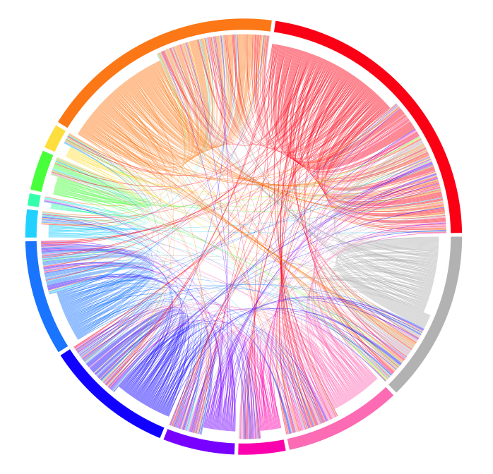
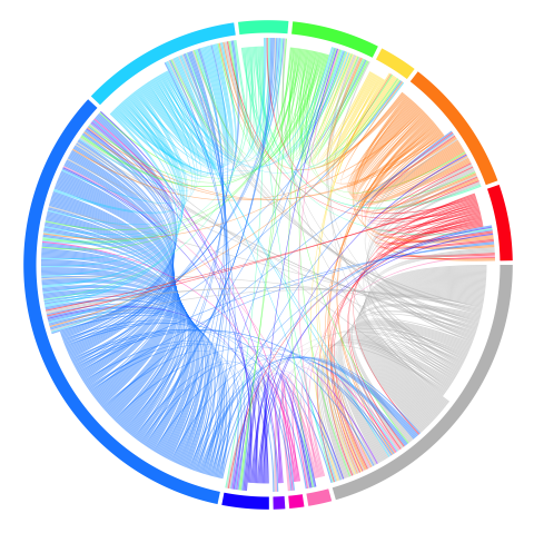
To visualize the usage of each color, I use chord diagrams, which display the relationships between colors in frames. Each frame is arranged radially around, with the color transitions between frames drawn as arcs connecting the source with the endpoint. Consequently, this also visualizes the frequency of a color in the frames as well.
AKIRA: CHROMA KEY
Even at a preliminary glance, the data (Figs. 4–9) reveals some interesting patterns that we would have missed otherwise. Let’s break down some of the more obvious ones first, and dive into some more interesting analyses later.


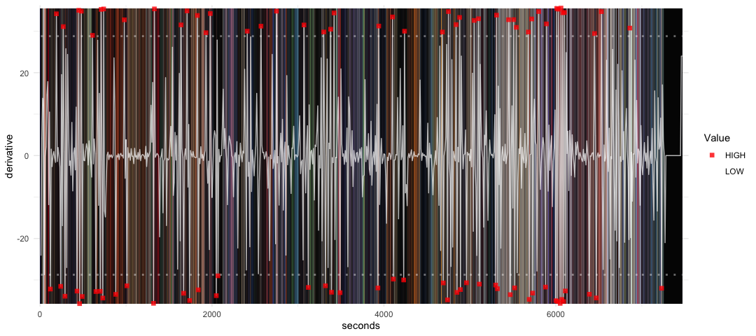


First, let us look at the temperature analysis’ numbers (Fig. 8). This graph seems to show that in the first half, as the film progresses, the color palette of Akira starts feeling colder, with heavier shades of blue. In frames, this manifests itself as a transition from city shots and exciting bike chases to hospitals and sewers. The second half of this graph, on the other hand, shows a much more interesting transition. Akira uses color as a means to build up suspense and bakes the classic Freytag five-act structure’s ‘Act 4: Falling Action’[2] into its color scheme quite literally. This temperature analysis graph clearly shows that the entire second-half of the film is simply a giant build up to its concluding ‘singularity’.
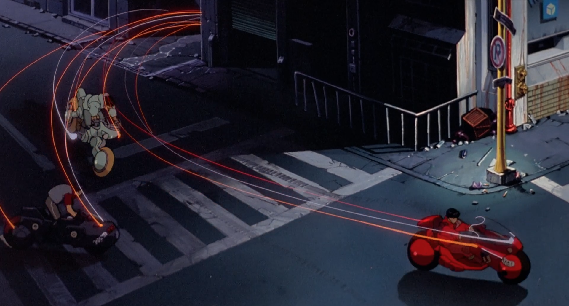
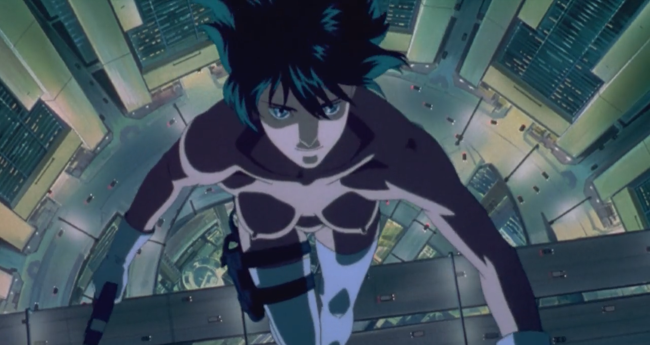
Secondly, observing the dips in this temperature analysis graph (Fig. 8), particularly the ones around 1,000 seconds and 6,500 seconds into the film, I noticed another interesting use of the color red in Akira: TRON streaks (Fig. 10). Throughout the film, Akira uses red and orange streaks of light that signify speed and agility, similar to the light trails TRON (1982) used for its light cycles. In a confusing, multi-storyline plot, these streaks remind the viewers’ who they’re rooting for. For instance, during the first bike chase, only our protagonists have bikes that leave behind trails. The antagonists are, on the other hand, on bikes that feel slow and unwieldy simply because they don’t leave trails.
Painting the “good” vs “evil” dichotomy
Mystery/horror stories often face a deep underlying challenge: how do you establish (and distinguish between) the “good” and the “evil” dichotomy while maintaining curiosity and fear in your audience’s mind? This challenge, when used well, can be in fact a gift. I know my heart was racing at the moment Jordan Peele’s Get Out (2017) revealed that Rose Armitage, one of the main characters, is actually a cold-hearted villain herself, when she’s been built up all along to be on our protagonist’s, Chris’ team. This experimentation is not unique to screenwriting. Even Sophocle’s Oedipus Rex (ca. 429 BCE) sets up its tragic ‘catharsis’ moment by manipulating this dichotomy.
While Get Out and Oedipus Rex are clear-cut examples of the use of this dichotomy, Akira, on the other hand, does something absolutely stunning with this challenge: it subtly uses color to manipulate the audience’s interpretations.
Let’s take a look at the chord diagram of Akira again (Fig. 9). Notice something odd? Clearly, Katsuhiro Otomo shows a disproportionate amount of love for bloody, fiery shades of red and orange, but more interestingly, he seems to under-utilize the color green. It can’t be a coincidence that an acclaimed artist such as Otomo specifically chose to underuse green, the G of RGB (one of the most popular characterizations of color space in art). I believe the use of green (or the lack thereof) holds very intentional purpose in Otomo’s masterpiece.
Signaling with color
Otomo’s sparing use of green makes it a rather easy color to analyze. Let’s look at some of the things that distinctively green in Akira (Figs. 11, 12).

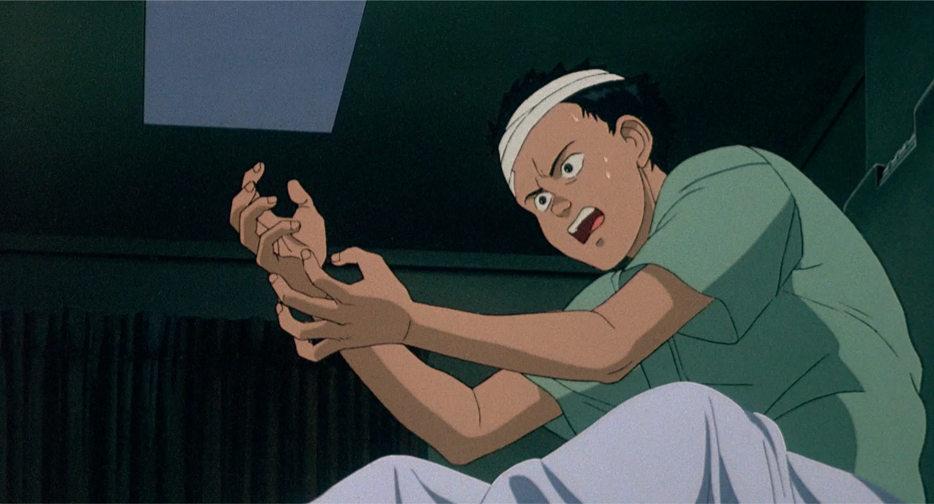
Figure 11 is a terrific scene captured from a feverish dream Tetsuo has after suffering from a seizure induced by his exposure to the supernatural powers. Notice the only two green entities in this frame: the young child that is Tetsuo, and his caring teacher. Tetsuo, a brooding teenager now, is reminiscing about his childhood, a time where he “mattered” to those around him, a time far away from the mess of Neo-Tokyo’s ruthless gang wars and more importantly, a time where the supernatural entity hadn’t trapped him.[3] Even in Figure 12, green is used to signify the “pre-corruption” Tetsuo: a rational, caring human being. However, just a couple scenes later, these same clothes acquire a different color, in Figure 13, when the “post-corruption” Tetsuo shows us his powers in a destructive rampage. Otomo seems to be reserving green for the “good”.

In fact, when you notice this, all other uses of green start making sense. While there are too many to individually comment on (for instance, Figs. 14 and 15), I will make remark on another major use: the children. The children have cyan/green skin tones (Figs. 16, 17). While, in the beginning of the film this skin tone is used for its “shock value” as the audience looks at a scary, alien child destroy the city of Neo-Tokyo, in what appears to be something akin to Batman’s origin story. As we later discover, though, this is just a subtle hint that these children are the “team” we will eventually root for.


Animation, and cel-drawing in particular, allows storytellers to infuse cues into the very foundations of environments, and Otomo and the team working on Akira clearly knew how to use colors to signal crumbs of information into their audiences’ mind.
Negatives: establishing a dystopia
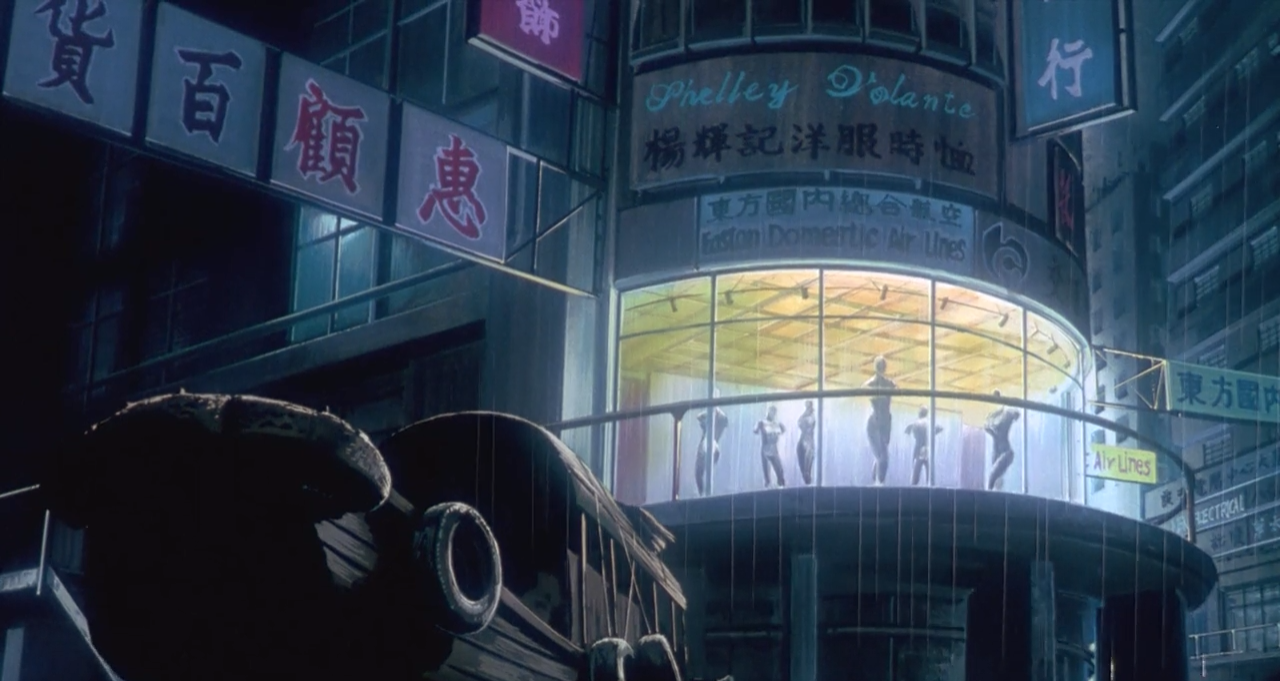
Establishing a dystopic setting is a rather non-trivial task, but Akira manages to establish the city of Neo-Tokyo as a post-apocalyptic metropolis rather quickly and smoothly. Director Katsuhiro Otomo cleverly starts the film with a bike chase, using the chase to weave a montage of cityscapes (such as Fig. 18) into plot progression. In all the sweeping hand-drawn shots, however, the color green is quite noticeably missing. Truly, the lack of green here is really a lack of greenery. There is nothing natural about the sprawling futuristic metropolis that is Neo-Tokyo. This has the effect of instilling an odd sense of unease, of unfamiliarity, in the viewers’ minds. And of course, this city is at sharp contrast with the Tokyo after the ‘singularity’ event at the end of the film, where we see water flood into Tokyo, and sun rays hit the city on this new dawn. A dystopia has been terraformed.[4]
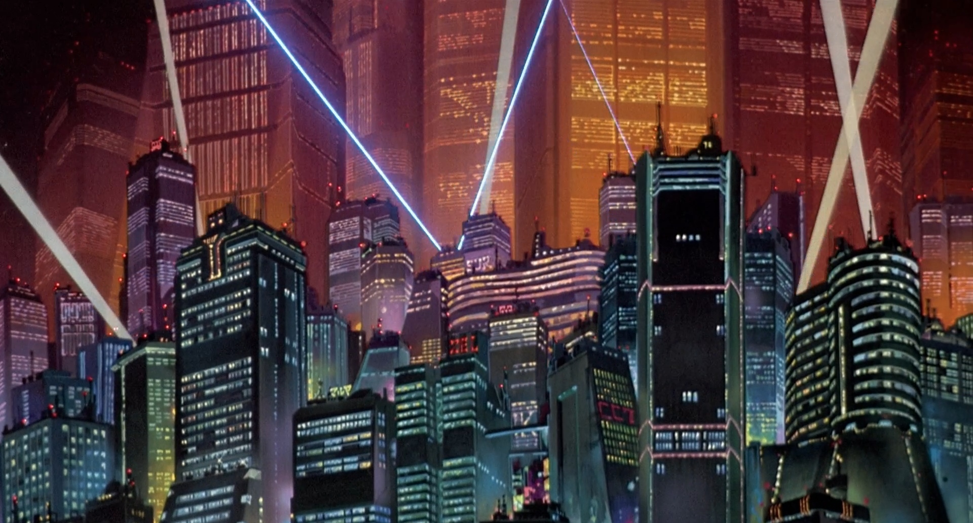
It is notable, however, that lack of green is not a defining feature of all dystopian settings. While Akira uses it beautifully to produce a sense of cyberpunk urbanism, there are other films such as the Matrix trilogy (1999–2003; Elvy, 2020), which tint everything in green, and still portray dystopias in a captivating manner. As director Katsuhiro Otomo said in an interview[5], he wanted [Neo-]Tokyo itself to be a major character in Akira. In Otomo’s world, the transition between a futuristic metropolis and a flooded post-apocalyptic city would be Tokyo’s character arc. Treating a city as a character allows Akira to do something special: as a viewer, it feels as if we can assign emotion and texture to a city, it feels intuitive.
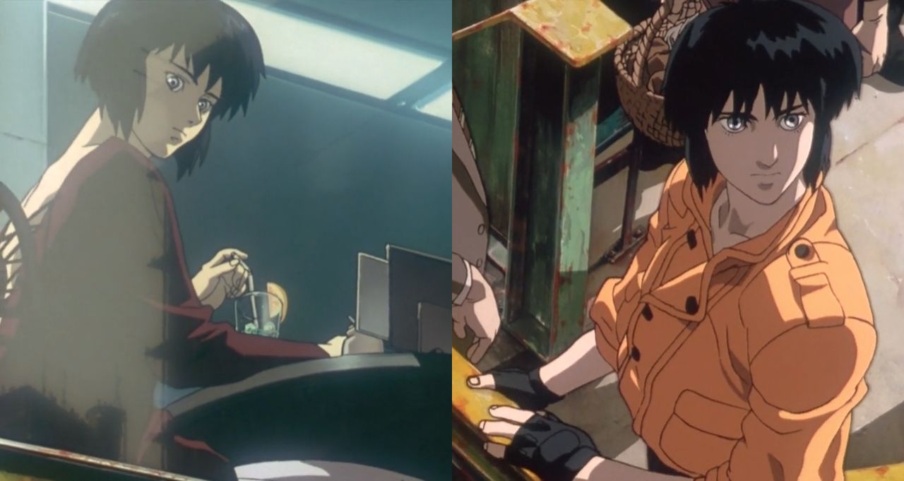
GHOST IN THE SHELL: ROTOSCOPING
Ghost in the Shell is a masterpiece of a philosophical text framed as a surreal exploration of identity and consciousness. To reduce it to mere graphic visualizations[6] is somewhat reductive to say the least, but nonetheless, these graphics (Figs. 19–24) can help us observe some interesting aspects of this retro-futuristic creepy film. As director Mamoru Oshii noted in an interview, Ghost in the Shell has extremely complicated origins in its manga, and he thought his job, as a director, was to condense the essence of the original universe into 80 minutes of reel.[7] My aim with the single page of visualizations was to condense these 80 minutes of reel into 1 page.


Dermatology
For starters, it’s quite evident from the movie barcode that the film is really about humanity. The film is full of close-up shots of faces, of the “shells” we are trapped in, and this focus is even more evident in the movie barcode, which looks akin to a skin tone chart. Even when the frames themselves focus a lot on close-up shots of “shells”, Ghost in the Shell is in part a philosophical exploration of the inevitable second order effects of the societal disregard for human bodies. There are many scenes where we see nude shots of ‘puppets’ who seem oblivious to their surroundings (Figs. 25–27). In any other anime film, we might be quick to dismiss these suggestive, voyeuristic shots as “fan service”, but Ghost in the Shell uses these to express something deeper. When bodies are purposeless shells, what does it even mean to sexualize them? What happens to our primitive social structures that use reproduction and voyeurism as a means of establishing society?

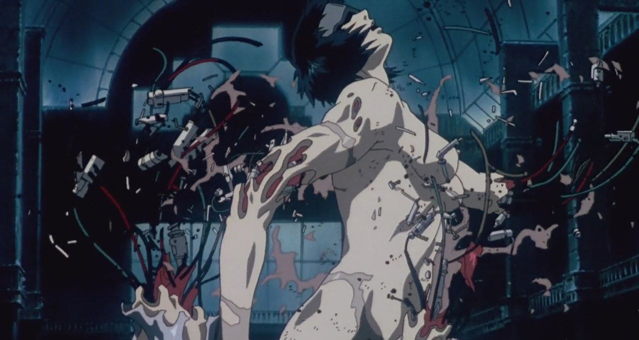
Another, more subtle second order effect resolves itself in the actions of soldiers and criminals. Action sequences in Ghost in the Shell are accompanied with gory shattering of the shells of the characters involved (Figs. 28, 29). As Major remarks after swimming in the sea (about 30 minutes into the film), when prosthetic bodies grant us this liberty to show a complete disregard for our physical wellbeing, how does one even feel “fear, anxiety, isolation, and darkness”, the feelings that are the essence of “hope”? In a poetic way, the climax of the film is a subtle consolidation of these two ideas. We see Major, stripped of her clothes, completely devour her “shell” in her manic quest to understand the “ghost” inside it (Fig. 30).


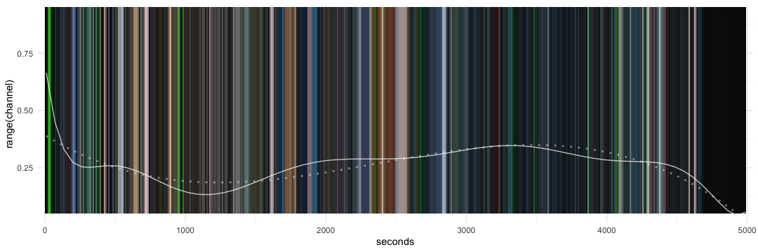
Let’s take a look at the temperature analysis plot of the film Ghost in the Shell (Fig. 23). Looking at this graph, it seems there is a striking change in tone at around 40 minutes into the movie. While the first half of the film seems to oscillate between cold and warm colors, the second half of the film has a consistent cold tone to it. In plot, this change seems to occur around the scene where we first learn of the Puppet Master’s escape. This change serves a subtle narrative purpose: the first half of the film focuses on the age-old existential questions of the Ship of Theusus[8] and René Descarte’s Cogito Ergo Sum[9], whereas the second half of the film focuses more on exposition and thriller action.
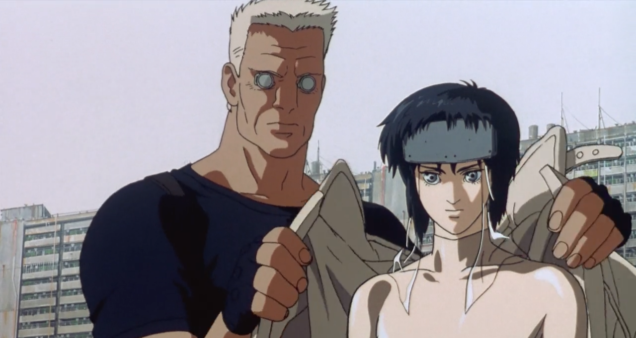
Notably, this change of pacing is also marked by shots that have an overwhelmingly tan/melanin color scheme, as shown by the movie barcode at about 42 minutes. These are actually two successive shots, the first being a close up of Batou in his characteristic tan jacket, towering next to the Major, and the other of Section 9 Security Chief’s lush oak offices, which juxtaposes the semi-human foreground characters with an organic background.
The horror of Socrates
From the perspective of an analysis, the first half of Ghost in the Shell is quite unique. While we learn about this world, we encounter the questions Motoko and the others have struggled to deal with, and now we the audience are forced to fence with them in our own lives. Even our very first intimate introduction to Motoko portrays her as a silhouette of a human being, a servant for the background city (Fig. 31). There is something starkly inhuman about this Frankenstein’s monster’s body that just gets up and leaves for work in sync with the unsettling retro-dystopic background music. From the very beginning, the audience is curious about the true nature of the identity of Major Motoko Kusanagi.

The most iconic scene in Ghost in the Shell, however, is the montage of cityscapes shown about 33 minutes into the film. In a 3 minutes 20 seconds interlude, we see 35 different shots of the city from the perspective of Major. While this has been picked over for its excruciating details by numerous reviewers[10],[11], I would like to focus on the “uncanny” interpretation of these visuals. To do so, however, we must rewind to the preceding scene (Fig. 32).

We see Motoko and Batou reflect on swimming, and this is the first time where we explicitly see them bring up the philosophical questions that have plagued humanity for centuries. However, the most striking interrogation comes towards the end of this scene. We (and the characters) hear an ominous, anonymous voice questioning, “Now it’s like we’re looking through a mirror. And what we see is a dim image.” As if searching for the source of this voice, Motoko looks around, until she stops her gaze right at the camera (Fig. 33). Are we the voice?

The camera quickly cuts to the aforementioned montage of cityscapes, and all the audience can do now is question their own humanity. There are extremely suggestive shots of what director Momoru Oshii wants us to think about, from (Figs. 34 vs 35, to 36 and 37), but the most chilling shot is the one of Motoko and another copy of her shell staring at each other across a window in Figure 37 (what she sees is, perhaps, “a dim image”?). If Motoko’s shell is just a cheap and random piece of trash from a black market, what even makes her her?

The solicitude of Heimat
Heimat (from the German) functions as the close environment that is understandable and transparent, as a frame, in which behavioral expectations are met, in which reasonable, expectable actions are possible – in contrast to foreignness and alienation, as a sector of appropriation, of active saturation, of reliability.
The English language, unfortunately, has no equivalent for the word Heimat, but it is perhaps the only word appropriate for the feelings of Major Motoko. Motoko is facing a deep identity crisis, and starkly lacks any sense of Heimat in her life. Motoko does everything in her power to protect and serve the citizens of Section 9, but in exchange, the city should owe her a sense of belonging. Motoko, however, feels robbed of this primal feeling, and this is what defines her soul-searching journey.
It is quite fitting then, that the movie ends in an abandoned museum, with Motoko getting shot up by the police force and being left to die. The entire second phase of the film is colored with a dark, gothic color scheme shrouded in rain. While the environment itself is a portrayal of melancholic feelings of identity, the foreground of the second half of the film is continually filled with action. We, the audience, are still coming to terms with the emotions of the characters, and more importantly, we are still grokking the philosophical questions raised by the first half of the film. The second half of Ghost in the Shell balances exposition, teaching us a lot more about the characters and their motifs, with thriller action. While Motoko herself has interesting character developments, Batou probably has the most interesting character arc in this half of the film. Throughout the film, Batou has served as our human representative in this confusing retro-futuristic world, and now, we see how much he truly cares about Major. He acts cautiously, but he still encourages Motoko to take the lead and find the answers to her questions. Whether it is the boat scene or the aftermath of the truck driver, we see Batou as Major’s guardian angel, and even at the end, Batou is the one who saves Motoko at the museum. Even director Mamoru Oshii subtly nods at this interpretation, literally showing Batou’s arm as Major’s guardian angel in successive shots (Figs. 39, 40).


Since it holds a lot of cryptic meanings, I would also like to explore the dialogue of the very last scene:
Major: Is this your safe house?
Batou: Yep. You’re the first person to ever come here. — And you’re welcome to stay as long as you like.
Major: Thanks, but I am going.
⋮
Major: “When I was a child, my speech was that of a child. My feelings and thoughts too were those of a child. Now that I have become a man, I part with the child-like ways.”
⋮
Major: Well, where shall I go? — The net is vast and infinite.
The movie ends (Fig. 41) with Motoko/Puppet Master waking up in Batou’s safe haven, where Batou welcomes her and requests her to stay with him. But having merged with the Puppet Master, she is a completely new being, as she acknowledges in her dialogue. She chooses to forego the human bond Batou has offered throughout the film. Now, the only space that can provide her Heimat is the “vast and infinite net”.
CONCLUSION
In this paper, I analyzed the films Akira and Ghost in the Shell. These are both seminal films that have greatly influenced modern horror/thriller/futuristic films and, as a result, they have been picked over by numerous reviewers and analysts. However, my approach to analyzing these films is quite different from the conventional methods. I used data analysis tools to make observations about “macro” trends in the films and rationalized these observations using scenes and clips. I hope my project inspires audiences to reconsider how they’ve looked at Akira and Ghost in the Shell and, perhaps, even reimagine the entire methodology of film analyses in the process. With computers as our “bicycles for the mind”, there is definitely a lot left to be done in the film department, and I hope that this analysis functions as a glimpse of that potential.

REFERENCES
Elvy, C. (2020) Why Matrix is so green on Netflix and how to watch with original color. Screen Rant. Available from: https://screenrant.com/matrix-green-color-change-netflix-original/ (Date of access: 30/Apr/2020).
Methods and credits
All the visualizations were made using a combination of Python, Julia and R (in particular, using the chroma R package).
The screen captures used here were taken from home video formats of Akira (Tokyo Movie Shinsha, 1988) and Ghost in the Shell (Production I.G, Bandai Visual, Manga Entertainment, 1995).
About the Author
Nalin Bhardwaj is a math and literature student at University of California San Diego. He primarily works in the tech industry, with research interests in algorithms and data structures, but he often writes about interesting art and literature on his website, https://nibnalin.me.
[1] https://en.wikipedia.org/wiki/K-means_clustering
[2] https://en.wikipedia.org/wiki/Dramatic_structure#Falling_action
[3] Even the camera’s placement reinforces this perspective. Tetsuo is looking at these moments from an inescapable, dark hallway, trapped by the entity that is slowly infecting his mind.
[4] Nature is healing, were we the virus?
[5] https://www.youtube.com/watch?v=xf0WjeE6eyM
[6] These visualizations also emphasize the ideas described in the discussion about Akira above. Ghost in the Shell is a lot darker than Akira. Yet, Ghost in the Shell’s scenes of darkness are punctuated by the team using a green and blue color palette.
[7] “It was a very difficult manga. After he told me to do it, I had to re-read it 20 more times. It’s a very difficult, complicated manga. So, I thought my job as a director is to make this complicated book into a simple movie.” (Mamoru Oshii, TIFF interview: https://www.youtube.com/watch?v=oM-rVr7Knzw).
[8] https://en.wikipedia.org/wiki/Ship_of_Theseus
[9] https://en.wikipedia.org/wiki/Cogito,_ergo_sum
[10] https://www.youtube.com/watch?v=ARTLckN9e7I
[11] https://echo-from-the-void.tumblr.com/post/180722199329/the-montage-sequence-in-gits